Over the weekend, we rolled out the first step towards a single, responsive web design for Bike Hugger and this is a quick post to explain what that means. RWD is like it sounds, “responsive” to the viewport and the screen size. For a desktop or mobile device, the same codebase is served. You can see that in action on the mobile site by resizing the window in your desktop browser and/ or rotate your phone or tablet.
Ethan Marcotte, aka @beep, wrote a well-reviewed book about RWD and speaks about the topic at Zeldman’s and Meyer’s An Event Apart. The names I dropped in the Hugga Mobile post about our new site including Kevin Tamura, Andy Clarke, and Aaron Gustafson. I’ve read, listened, and observed what they’ve been doing for the past few years and spent time Googling and climbing back out of various rabbit holes about the topic.
I’ve got the demands of a thriving blog and 5 years of cruft on Bike Hugger, so I decided to publish a mobile site first. Then take that new, clean code and flip it to one design when we’re ready. Tasks we’re working on include the 3rd version of about twenty banners will try. How and where to place ads, image sizing, featured content, and comments are also being considered. Mobile shopping too.
In keeping with my, “from this day forward” mantra for websites and “you go out, you get better,” approach, I’m publishing now, as if the site was served to an entirely mobile audience. In the next rev, you’ll see one design for those on the desktop too.
Publishing with shiny and new HTML5 templates plugged into Expression Engine is like racing on a new bike. Faster, lighter, and something to get used to. It also means leaving the beat-up, old bike in the garage.
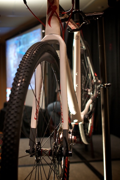
Shiny new, Crux with disc brakes
To give RWD some context to the bike industry, it’s like a road bike with disc brakes. Disc brakes and RWD are new, different, controversial, and being talked about. Some insist and others aren’t so sure. Disc brakes depend on the conditions, where you ride, and the style of riding. For comparison, responsive design is for the type of website you publish. Our audience is mobile, active, and early adopters. Bike Hugger should be that too.
The project so far
- Migrate to Expression Engine – done
- Launch Mobile Site – done
- Launch responsive design – in progress.
Random Resources
- A Book Apart
- Hard Boiled Web Design
- Golden Grid System
- Less Framework
- The Square Grid
- Louis Kahn
- The Unigrid system.
Also see @beep’s work on the Boston Globe.
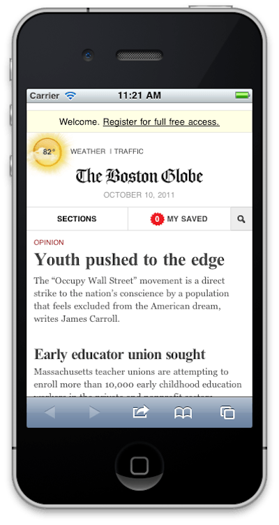
Boston Globe’s responsive design
…We're riding townies, adventure, and mountain bikes. Find recommendations on our store page. As Amazon Associates we earn from qualifying purchases.