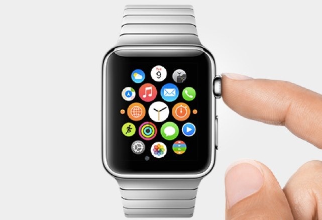
Just after I rode my bike into a parked car while trying to figure out the UI on a Garmin 810, I began to speculate publicly about what then were early rumors of an Apple watch and how they would do to fitness what the iPod had done to music. Today they have done just that.

At the dawn of the iPod era there were a number of competing, ugly, cumbersome and limited devices. Each of them could hold a bit of music, most of them had their own music management software. None of them were good.
The iPod took the conventional designs of the day and threw them out, changing everything with a new interface and a device large enough to store complete music collections. They then added to that with a player that was simple to use and seamlessly integrated with the device.
The new Apple Watch (or technically the Watch) will revolutionize much of the portable computing world, but it will have a tremendous impact on the fitness world, even for those that don’t but it. That’s because the User Interface (UI) and the User Experience (UE) are so groundrbeakingly advanced that they instantly make every other tool on the market look dreadful.
When the first GPS-based cycle computers came out, the hard-wired LCD computers of the day suddenly looked antique. Big numbers, sensor-free recording and (on some units) turn-by-turn directions brought a whole new level of functionality to cycling. As their capabilities grew through ANT+ sensors and Bluetooth technology, they began to offer functionality that the previous round of technology couldn’t even contemplate.
But since then the UI and UE of these devices have pretty much stalled. Garmin has added features to their devices, but hasn’t really refreshed the look or feel of their hardware. There’s little to differentiate the Garmin Edge 1000 from the Garmin Edge 100 from which it came, and I’d even argue that the UI of Garmin’s devices is worse now than it was when the Edge 100 came to market so many years ago.
I don’t think that a sports watch is necessarily the best solution for the cyclist, but I’ll wager that Apple Watch-specific bike mounts are coming to Kickstarter any day now. But what’s really important is that Apple has entered the wearable space, has focused on fitness, and has opened development up to programmers. I’m looking forward, for example, to Strava segments that use the haptic feedback technology of the watch to announce the start and end of a segment, or coaching apps that tap out a cadence through the watch to tell a cyclist when to start an interval and give heart rate feedback.
By tying the watch into the phone, Apple extends a good technology and makes it better and that’s something that hasn’t really happened in fitness. Companies have made stabs at this, but their devices usually need to come back and talk to an app to be useful, while the Apple Watch will use wireless communication with the phone to provide even more information than if it were used alone. And unlike the Garmin Edge, it won’t just be good for the bike, everyone from runners to cross fit junkies will be able to use the device to participate in custom-created fitness programs.
The first generation of the iWatch might not change fitness overnight, but it’s an incredible looking first-generation tool. More importantly it’s a shot across the bow of every fitness device manufacturer in the world—make products that are as easy to use as Apple’s new watch, or see your customer base fade.
A decade from now we’ll probably laugh at the simplicity of the Apple Watch compared to the wearable devices Apple and others are making, but today Apple’s announcement has provided a much needed boost to the fitness sector and will hopefully usher new people into cycling and into other sports. Today marks the end-of-days for ugly and complicated fitness devices and the start of a new era of beautiful technology.
…We're riding townies, adventure, and mountain bikes. Find recommendations on our store page. As Amazon Associates we earn from qualifying purchases.