Oregon Manifest Teams Respond

Original, iterated, or copied?
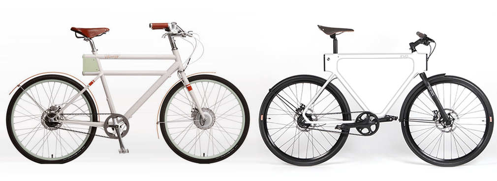
After asking the organizers of the Oregon Manifest a question about the project’s originality, received these responses. I thought and saw comments in social channels that the project’s bikes are similar to Vanmoof and Faraday.
First from Mark Prommel, Partner & Design Director, Pensa
As designers, we at Pensa and Horse Cycles take questions of originality very seriously so I wanted to respond.
We passed all of the ends of the top tube, seat tube and down tube past their expected termination points to create four open, functional access points to the inside of the frame. Visually I think this creates a unique and fresh gesture to the frame shape that we have not seen before, especially due to the large radius bends of the seat and down tubes and the lack of connection from the seat tube to the actual seat.
What we are doing here is very new. Everything is inside. We have a fully wired and lit, spring-loaded rear aluminum rack that is retractable and disappears into the frame with the touch of a button. An integrated bungee system is then built into the curved seat tube along with a retractable fender. In the front two ports we have USB charging and lighting. Our lighting glows through a custom laser cut pattern in our frame.
The concept of Merge is that at any moment it can be stripped down to a minimal urban ride with nothing attached. We believe this is a unique concept, both visually and functionally, that we haven’t seen executed before.
Here are a few shots of Merge that I believe illustrate the unique look and functions of the bike.
The rest of the shots are in a G+ gallery
Then Chris Harsacky, Partner, at HUGE wrote
I think these two designs are very far apart in overall form and function.
Our main aesthetic goal was to achieve a symmetrical frame to balance the front and rear connection areas. I think its pretty unique in shape, function, and construction method. Here’s actually some of the early sketches that inspired the final direction.
Design sketches made during the project
MERGE with charging pocket and USB
As Patrick wrote yesterday, “They said, ‘ultimate,’ remember?”
Perhaps an approach in the next episode of their show would consider iterating ideas? Like a Project Runway challenge, a Tim Gunn-type would take a team of agency designers to QBP’s warehouse with a budget, and a shopping cart. Then out the other side, their task is to bring an affordable, desirable utility bike to market, and not another unworkable, impractical design.
A potato-gun top tube is a distinctive Vanmoof design
Taco from Vanmoof also responded.
At VANMOOF we set ourselves the goal to design the perfect urban commuter bike, exactly the designs challenge of the Bike Design Project. We thinks it’s great to see some similarities with VANMOOF in all the five models. We see most of the five design teams focusing on the integration of parts and accessories, just like we did with the lights, lock, carriers and electronics. We are happy to see that these American design teams see the same needs for urban commuter bike as we did, it confirms our thought that the demand for VANMOOF bikes will further increase in the USA.