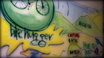
Working with Patti Dobrowolski, Alchemy, on visually mapping out our strategy in 09 and for Hugga 2.0. This video is a peek inside the creative thinking going on at Hugga HQ, our approach to Social Media, and part of what I’ll talk about next week at Web Design World Boston.
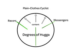
This should prove far more useful than the humorous look inside Bike Hugger’s Brain and our Degrees of Hugga chart.
 What’s particularly useful is Patti’s techniques allowed us to just talk out where we are, want to go, and the steps to get there – we visualized all those thoughts and can see them on paper. She helped us illustrate the issues, goals, and highlighted what we think is important.
The visual map shows that we’ve built much momentum with the blog, retail, and our Mobile Socials – thanks to our readers we’ve had outstanding growth. We want to build on that and continue with more unique products (just released our Wool T), events and publishing content you want to read. I’ll talk more about Hugga 2.0 when we publish our new design in the next few weeks.
What does Hugga 2.0 Look like?
Until then, please tell us what you think about our next version of Hugga? More Cargo posts? More commuter? Bike racing? And what goods would you like us to sell?
…We're riding townies, adventure, and mountain bikes. Find recommendations on our store page. As Amazon Associates we earn from qualifying purchases.
